When I joined K Series Parts (KSP) as a designer, the company was in the midst of a rebranding effort with an external branding agency. However, the logos produced by the agency missed the mark, appearing more suitable for a tech company rather than an aftermarket auto parts business. Given my background in working on vehicles, the owners asked me to take a chance on designing a logo that would resonate with their brand and customer base.
K Series Parts is a thriving $10+ million a year business that specializes in aftermarket parts for Honda, Acura, and other Japanese imports. The initial problem was that the branding agency’s designers, who likely had little automotive experience, couldn’t create a logo that felt authentic to the brand. The company needed a logo that spoke directly to their automotive-savvy customers and reflected their industry.
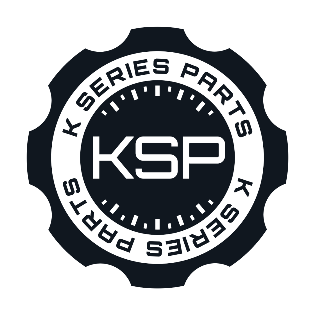
To start the project, I took a hands-on approach by examining my own car’s dashboard and under the hood. This exploration helped me identify useful shapes and design elements. The oil cap, with its distinctive shape and markings, stood out as a perfect basis for the logo. This straightforward insight highlighted a gap in the agency’s approach—they hadn’t truly connected with the automotive essence of KSP. The oil cap, combined with elements reminiscent of a speedometer, formed the core of my design concept.
The design process involved multiple iterations to refine the logo, ensuring it included both the abbreviation “KSP” and the full company name. Using Adobe Illustrator for its precision and scalability, I maintained the fonts and colors from the original branding guidelines but took the logo in a new, more fitting direction. The resulting design featured the oil cap shape with speedometer elements, symbolizing both the technical and racing aspects of the brand.
The final design was met with enthusiasm from the KSP team. They appreciated how the new logo accurately represented their brand and resonated with their customer base. This design was implemented across various products, including work shirts, stickers, and hats, and remains a prominent part of their branding today. The client feedback was overwhelmingly positive, with the owners choosing my logo over the branding agency’s proposals, emphasizing their love for the new design.
Reflecting on this project, I realized the importance of taking simple, practical steps to understand a client’s industry better. The primary challenge was overcoming a lack of hands-on investigation by the previous designers. By taking the time to physically explore automotive elements, I was able to create a logo that truly embodied KSP’s identity. The lesson learned here is that sometimes, a straightforward approach and a little extra effort can lead to significant results.